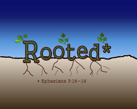
Created this logo for the young adult ministry at church and would appreicate input on it. Let me know what you think or ways it can be improved.

Created this logo for the young adult ministry at church and would appreicate input on it. Let me know what you think or ways it can be improved.

Love it! What a great idea!
LikeLike
Thanks
LikeLike
Hi
I think it is well done. I looked at it looking for symbolism for what it is designed to be, a logo for a Christian ministry. I like the visual of seeing the word rooted and below it, the Bible verse. I like that the leaves are in 3s which reminds me of the Trinity. I feel like something needs to be done with the roots. Could the roots be modified to reflect the Bible verse notation? Just an idea. I think it’s nicely done!
LikeLike
Hi. Don’t know you, don’ have any art degree or anything like that, but saw the request for input. I think the lines for the roots should be longer/deeper/more involved, but looks great 🙂
LikeLike
looks cool
LikeLike
You should crop out any excess sky or ground. The roots could be more detailed. And maybe have some divine light shining from above.
LikeLike